📢 Netvisor Starter-paketti pienyrityksen tarpeisiin. Kiinteään hintaan alk. 39 € / kk 💎
Netvisor short brand guide
Press kit
This page provides media and partners with quick access to our core brand assets. You’ll find our official logos, primary colors, and direct links to download high-resolution files from our Material Bank below.
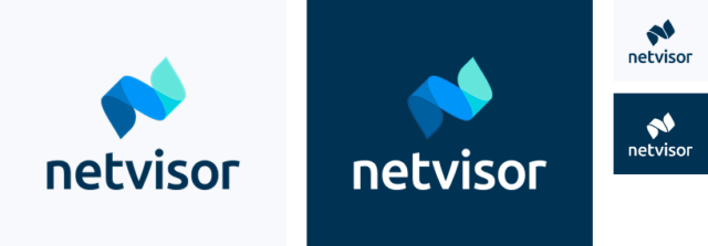
Netvisor logo
Primary logo
Primary logo should be always used if possible.

Other versions
Secondary (cutout) logo
Single colour logo is used only where primary logo is not possible to use.
Vertical logo
Vertical version of the logo can be used when primary version doesn’t fit your composition. Vertical version is also used in our video end-plates for vertical and square aspect ratios.

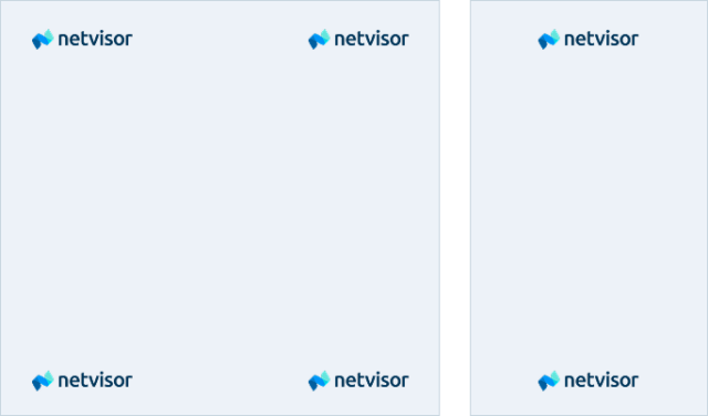
Placing the logo
As a rule of thumb, place the Netvisor logo to the top left, top right, lower left, or lower right of the canvas. The logo can be centered in narrow layouts, in a video or on a slide, but for the most part it shows up in a corner.
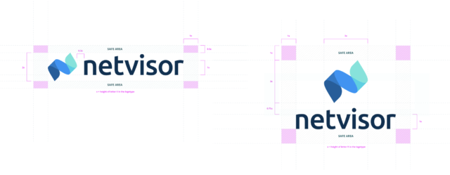
Safe area
This is the minimum space that should not contain any graphical element so the logo can stand out. Note that the logo is centered according to the logo mark, not the logotype.
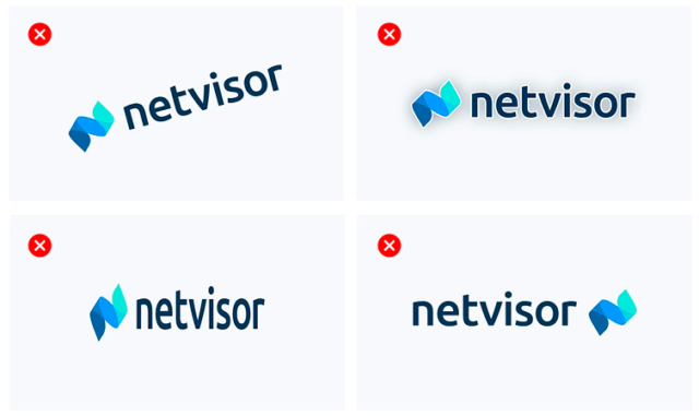
Restrictions
Please, don’t adjust or distort Netvisor logo in any way. Also, don’t rotate logo or add effects to it. And ensure logo is visible properly.
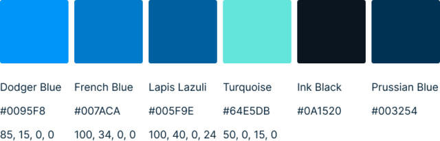
Colour palette (primary)
Deep Space Blue
#13314F
Dark Turquoise
#02D1E4
59, 0, 22, 0
Light Cyan
#CCF6FA
Bright Snow
#FAFBFC
White
#FFFFFF
Colour usage and proportions

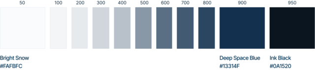
Secondary palette
Netvisor Neutrals
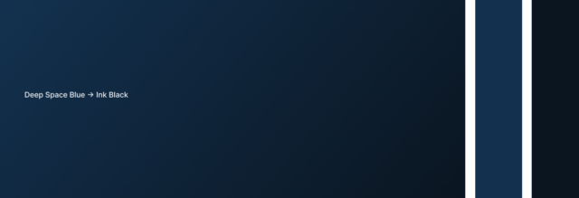
Signature gradients
Typography
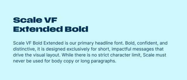
The fonts Netvisor uses are Scale VF Extended Bold or Inter Tight for headlines and titles, and Inter for body copy.
Primary headline font is Scale VF
Scale VF is a variable font and available for activation from Adobe. We use Scale VF Extended Bold for Primary headline font when possible (advertising, physical merch, etc).
Scale Variable is included in Adobe CC font collection and activated only if user has it.
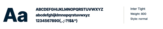
Alternative headline font is Inter Tight
Inter Tight is our brand typeface for headlines and titles when Primary headline font is not in use. We use mainly Extrabold (800) weight in titles and headlines. For smaller headlines it may be necessary to use Bold (700) or Semibold (600) weights.
https://fonts.google.com/specimen/Inter+Tight
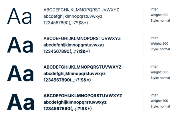
Secondary font is Inter
Inter is our brand typeface for body copy. We use Normal (300-500) weight mainly.
Downloads
You can download our core brand assets from our material bank.
For further questions or specific asset requests, please contact us at [email protected]